katherine lubar
Colour Intervals: |
||
|
Applying Concepts of Musical Consonance and Dissonance to Colour |
||
by Katherine Lubar |
||
| An edited version of this article was published in the May 2004 edition of the journal Leonardo (Vol. 37, No. 2) | ||
|
As I have been a painter and a musician for most of my life, I have constantly been
on the lookout for correlations between visual art and music, perhaps
to bring together these two seemingly separate halves of my life.
Often, studying one form of artistic expression can inform another;
I found when studying music, I developed a greater understanding
of painting, one example being that of unifying motifs which one
often finds reappearing throughout a musical composition but which
can also be found visually in paintings — shapes or lines that
appear in different guises (ie, inverted, bigger, smaller, etc).
Because of this, I have always been curious as to whether there were
other elements in music that could be applied to the visual arts.
In this instance, I would like to examine relationships between colour and music, a topic that is by no means new and which has had many theories applied to it over the centuries. Artists such as Kandinsky, Klee and Vantongerloo; composers such as Scriabin, Berlioz and Debussy; and scientists such as Newton, Kepler and Helmholtz have all explored links between colour and music. Kandinsky associated the sounds made by certain instruments with certain colours in Concerning the Spiritual in Art [1] published in 1911. Klee used temporal and rhythmic aspects of music in his paintings [2]. The poet Goethe felt that both colour and music are both ‘referable to a higher formula… like two rivers which have their source in one and the same mountain.’[3] Newton, Helmholtz and Scriabin tried to find a correlation between individual musical notes and hues on the colour wheel. [4] I initially spent some time exploring this avenue of matching colour with pitch. Both sound and colour can be expressed as waves, which can be measured in Hertz, so it seemed obvious to try to match these up. The scientific definition of dominant wavelength links any colour to a single wavelength of light. Both light and sound may be described using a common relationship derived from wave physics: |
||
| Speed (measured in metres per second) = Frequency (in beats per second, or ‘Hertz’) times Wavelength (in metres) | ||
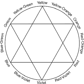
| The traditional colour wheel/hue circle used in most Western art schools today is the pigment or mixing wheel originally developed by Johannes Itten. | ||
|
||
| Fig. 1: Colour Wheel | ||
|
This colour wheel uses subtractive colours, meaning the pigments in an object cause
it to absorb certain light waves and reflect others [5].
It contains 12 colours: Red, Red-Orange, Orange, Yellow-Orange, Yellow,
Yellow-Green, Green, Blue-Green, Blue, Blue-Violet, Violet and Red-Violet
just as the modern day Western musical scale has 12 semitones: C,
C#/Db, D, D#/Eb, E, F, F#/Gb, G, G#/Ab, A, A#/Bb, B.
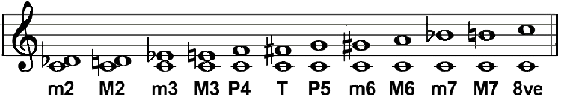
I attempted to carry out this comparison using the first few notes of La Traviata. I thought if I sketched out the melody by using stripes of colour correlating lower frequency colours to lower frequency sound waves (and higher to higher, etc.), the melody would somehow make itself felt, albeit in a different form. I used red as my starting point – as the ‘lowest’ colour, as it has the lowest frequency [6]. The end product was interesting, but in no way reflected the feeling one got from listening to this piece of music. I then had the idea of creating a colour scale in terms of value. Colours can be categorised by their brightness, with yellow being the brightest and violet the least bright, so I applied this hierarchy to the melody, assigning the highest note to yellow and the lowest to violet, painting out the stripes of colour as before. This seemed to work a little better than the first experiment — there seems to be something in the value scale that can relate to melodies — however, I didn’t think it was a complete success. There is something in the nature of each colour that gives it a specific character; whereas a melody can be transposed to different parts of the keyboard and still retain its character. So I concluded that it’s not possible to create a system that assigns a note to each colour and have that work in terms of expressing a similar aesthetic feeling. My next idea was to compare the visual effect of colour intervals with the aural effect of musical intervals, an idea that had, centuries before, been put forward by Aristotle in his De Sensu et Sensili. ‘It is possible that colours may stand in relation to each other in the same manner as concords in music, for the colours which are (to each other) in proportions corresponding with the musical concords, are those which appear to be the most agreeable.’ [7] In music, one is taught early on that certain intervals are ‘harmonious’ and that others are ‘discordant’[8]. The idea of what is harmonious or discordant in Western music has not changed a great deal over time, although the rules governing the use of discordant intervals have. For example, the monks in the middle ages allowed the tritone — the most discordant interval of all — to be used in certain combinations of notes but in the Renaissance, it was dubbed the ‘devil’s interval’ and its use became forbidden. A modern definition of what makes an interval consonant or dissonant describes its stability [9]. The consonant intervals produce a feeling of stability, while the dissonant intervals create a feeling of activity or tension. One can recall this in the works of the 19th century Romantic composers, who started to use the dissonant intervals to create a feeling of tension in order to heighten dramatic effect. The more dissonant an interval, the more one is given the feeling of movement — of seeking a release from the tension. This release is achieved by the culmination of the musical idea in a consonant interval. Of course, some later composers did away with the resolution of the dissonance into a consonance altogether, and preferred to let the tension remain in the air, or even used the juxtaposition of a stronger and weaker dissonance so that the stronger resolved into the weaker, making the latter sound almost consonant. For the purposes of this paper, I shall use the current categorisation of consonances and dissonances, as found in recent Western music theory textbooks [10]. The commonly held consonant intervals in musical composition are as follows: Minor 3rd, Major 3rd, Perfect 4th, Perfect 5th, Minor 6th, Major 6th and Octave [11]. The commonly held dissonant intervals are: Minor 2nd, Major 2nd, Tritone (the interval between the 4th and the 5th), Minor 7th and Major 7th [12]. Musical intervals are counted by how many semitones they span. |
||
 |
||
| Fig. 2: The intervals in a Western musical scale | ||
|
Minor 2nd (m2) = 2 semitones Major 2nd (M2) = 3 semitones Minor 3rd (m3) = 4 semitones Major 3rd (M3) = 5 semitones Perfect 4th (P4) = 6 semitones Tritone (T) = 7 semitones Perfect 5th (P5) = 8 semitones Minor 6th (m6) = 9 semitones Major 6th (M6) = 10 semitones Minor 7th (m7) = 11 semitones Major 7th (M7) = 12 semitones Octave (8ve) = 13 semitones |
||
|
One can figure out the interval between two colours by counting the distance of colour-semitones
they span on the colour wheel. For example, the interval between Yellow
and Red would be a Major 3rd as there are 4 steps between them (as
in music, one includes the notes/colours on either side of the interval).
If we take the colour Red, its intervals are as follows: |
||
|
Red—Red-Orange = m2 Red—Orange = M2 Red—Yellow-Orange = m3 Red—Yellow = M3 Red—Yellow-Green = P4 Red—Green = T Red—Blue-Green = P5 Red—Blue = m6 Red—Blue-Violet = M6 Red—Violet = m7 Red—Red-Violet = M7 Red—Red = 8ve or unison |
||
|
Because the colour wheel is circular, the interval between two colours can be counted
in either of two directions. In colours with similar tonal values
(meaning how light or dark a colour appears), the interval perceived
will be the one with the smallest distance between the two colours
on the wheel. Thus, what is counted as a Minor 6th in one direction
(for example, Red—Blue) will be counted as a Major 3rd in the
other direction (Blue—Red). Therefore, in colours of similar
tonal value, any interval above the tritone — the interval
that marks the middle of the octave — is purely theoretical
and will be inverted.
In music, intervals can be inverted and I think it’s possible to apply this principle to the colour wheel. On the keyboard, we can invert an interval of an octave or less by bringing the lower tone up an octave or the upper tone down an octave. The numerical size of an interval plus that of its inversion add up to 9. Minor inverts to major and vice versa and Perfect intervals always stay Perfect. If we take a Minor 3rd, 9 - 3 = 6 so the inversion of a Minor 3rd would be a Major 6th. The intervals and their inversions are as follows: |
||
|
m2 — M7 M2 — m7 m3 — M6 M3 — m6 P4 — P5 T — T P5 — P4 m6 — M3 M6 — m3 m7 — M2 M7 — m2 P8 — P1 (unison) |
||
|
Each interval has a similar sound to its inversion and this is also true for the
colour intervals and their inversions.
The only way to perceive one of the larger intervals without inverting it is if there is a strong contrast in tone. In Patrick Caulfield’s ‘ Kellerbar’ of 1997, he places an extremely pale yellow next to a dark forest green. If the tonal values had been similar, the interval would be perceived as a Major 2nd but as they are so disparate, it is felt as a Minor 7th. The contrast in tonal value has created enough distance to give you a feeling of distance on the colour wheel. Thus tonal value plays an important role in the interpretation of the intervals between colours. |
||
Now I would like to examine some colour intervals and see if they bear any relation
to their musical counterparts.
The Minor 2ndThe Minor 2nd is the smallest possible interval in Western music; it is the interval between a given note and the nearest note on either side of it. It is considered a dissonant interval, but has been used, along with the Major 2nd, to great effect by contemporary composers, especially in works for the piano.In painting, the Minor 2nd does not appear overly dissonant, but is perhaps not very interesting or appealing as far as intervals go, as it has the least amount of contrast; However, when it is used in conjunction with another colour that is more spaced out on the colour wheel it can be very effective. And this is a combination that can be found frequently in painting — a Minor 2nd with a more distant interval, as it achieves both subtlety and contrast — you might even say harmony and dissonance — at the same time. |
||
 |
||
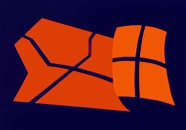
| Fig. 3: Shapes. The Red and Red-Orange in this painting constitute an interval of a Minor 2nd. This is considered a dissonant interval in music and it is not a strong colour combination. It works in this painting, because the Blue provides a contrast, giving it a more balanced feeling. | ||
|
Click to play a Minor Second |
||
|
It is similar to the Minor 2nd in music in that it is not the most pleasing colour
combination and it usually requires some additional treatment, such
as the introduction of another colour to make it work harmoniously;
but it depends on the desired outcome — perhaps a dissonant
effect is what is required in a painting, as it might often be in
music, in which case it can be used on its own.
One can also achieve an interesting effect with a Minor 2nd by using contrast in a different area, such as in light and dark. However, this could be interpreted as a Major 7th, depending on how strong the contrast is. |
||
 |
||
| Fig. 4: Morning. The Red-Violet and Violet would normally equate to a Minor 2nd but because of the strong contrast in tone, they could be perceived as a Major 7th. | ||
Minor 2nds: |
||
|
Red—Red-Orange Red-Orange—Orange Orange—Yellow-Orange Yellow-Orange—Yellow Yellow—Yellow-Green Yellow-Green—Green Green—Blue-Green Blue-Green—Blue Blue—Blue-Violet Blue-Violet—Violet Violet—Red-Violet Red-Violet—Red |
||
The Major 2ndOne half-step larger than a Minor 2nd, the Major 2nd has similar characteristics, although it is not a particularly strong dissonance musically and is a bit less subtle when used in colour. |
||
|
Click to play a Major Second |
||
Major 2nds: |
||
|
Red—Orange Red-Orange—Yellow-Orange Orange—Yellow Yellow-Orange—Yellow-Green Yellow—Green Yellow-Green—Blue-Green Green—Blue Blue-Green—Blue-Violet Blue—Violet Blue-Violet—Red-Violet Violet—Red Red-Violet—Red-Orange |
||
The Minor 3rd
Considered slightly less stable than the Major 3rd, the Minor 3rd has a slightly ‘sad’ sound
to it; it is the first part of a minor triad and is considered consonant. The
Major and Minor 3rd, along with the Major and Minor 6th, are described as ‘imperfect
intervals’ and are characterised by their movement.
In painting, the Minor 3rd is a lovely combination; harmonious, but still fairly subtle, as it is not a very great leap. There is something of the feeling of ‘sadness’ or ‘gentleness’ that occurs in the musical equivalent. |
||
 |
||
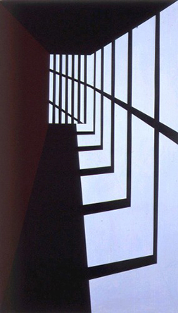
| Fig. 5: Prison Hallway. The Red-Violet and Blue constitute a Minor 3rd, although this could also be perceived as a Major 6th because of the tonal contrast. There is a feeling of subtlety and sadness that also appears in the musical equivalent. | ||
|
Click to play a Minor Third |
||
Minor 3rds: |
||
|
Red—Yellow-Orange Red-Orange—Yellow Orange—Yellow-Green Yellow-Orange—Green Yellow—Blue-Green Yellow-Green—Blue Green—Blue-Violet Blue-Green—Violet Blue—Red-Violet Blue-Violet—Red Violet—Red-Orange Red-Violet—Orange |
||
The Major 3rdThe Major 3rd is normally thought of as a quite cheerful, consonant interval. It is the first interval of the major triad and is considered to be the most stable interval after the Perfect 5th and Octave. It is the most consonant of the imperfect intervals.The Major 3rd colour combination does indeed appear ‘cheerful’; the spacing of the colours on the colour wheel provides ample contrast, and constitutes a harmonious pairing. |
||
 |
||
| Fig. 6: Opening. This major 3rd combination of blue and yellow has a 'cheerful' quality, similar to a musical 3rd. This quality can also be found in other 3rd colour combinations. | ||
|
Click to play a Major Third |
||
Major 3rds: |
||
|
Red—Yellow Red-Orange—Yellow-Green Orange—Green Yellow-Orange—Blue-Green Yellow—Blue Yellow-Green—Blue-Violet Green—Violet Blue-Green—Red-Violet Blue—Red Blue-Violet—Red-Orange Violet—Orange Red-Violet—Yellow-Orange |
||
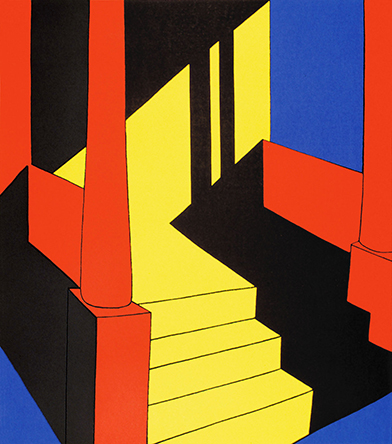
The Perfect 4thThe Perfect 4th is usually considered to be consonant but at times can be considered dissonant depending on how it is used. In medieval times, it functioned as a stable interval but once composers started using major and minor triads more frequently, the Perfect 4th lost some of its status as a consonant interval. With the increased use of the 3rd as an interval, the 4th became a stepping stone to get to the 3rd and was thus considered more active and less stable. When the 4th is played near to a Perfect 5th however, it retains more stability and can be classified as consonant. In addition, when it is heard on its own and not in the context of other pitches, it has a highly consonant feel.In painting, the Perfect 4th — along with its inversion the Perfect 5th — is found frequently. It is just one step away from being a complementary interval (the exact opposite on the colour wheel), and thus creates movement within the colours — as they strive to reach their true complements. This striving, I believe, can often be more effective in painting than actual complements. |
||
 |
||
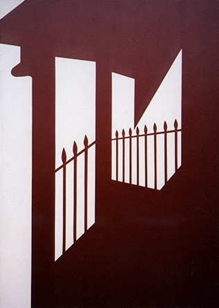
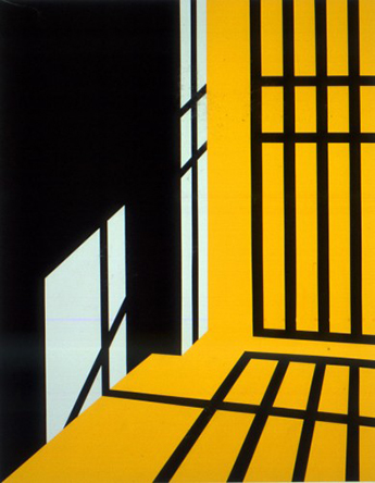
| Fig. 7: Light in Corridor. The pink operates as a Red and is a Perfect 4th away from the Turquoise. The Red-Orange of the background is a Minor 2nd from the Pink/Red and this is a very common use of colour in painting - to have a distant interval such as a 4th or 5th in combination with a Minor 2nd. | ||
|
Click to play a Perfect Fourth |
||
Perfect 4ths: |
||
|
Red—Yellow-Green Red-Orange—Green Orange—Blue-Green Yellow-Orange—Blue Yellow—Blue-Violet Yellow-Green—Violet Green—Red-Violet Blue-Green—Red Blue—Red-Orange Blue-Violet—Orange Violet—Yellow-Orange Red-Violet—Yellow |
||
The TritoneThis is a very special interval, as it falls exactly in the middle of a 12-tone scale, dividing the octave in half. It is the most dissonant musical interval there is, with an extremely distinctive, jarring sound. (If you have an instrument nearby, try it — for example C to F# — it is a sound you are not likely to forget!)Colour-wise, the equivalent to the tritone is the complementary of a colour. This is the most difficult interval to relate to its musical equivalent, as in music it is considered the most dissonant and in painting the most consonant. But perhaps these are merely two sides of the same coin. The complementary colour combination is the most striking; it jumps out at you. And the same can certainly be said for the harsh Tritone. The Tritone has been used effectively in many contemporary musical compositions — it contains a great amount of energy and dynamism. Alan Wells, who has written a number of papers on colour and music, noted that, ‘chords built on tones at this interval of the tritone or half an octave, when played in succession, had a startling and contrasting, yet stimulating and pleasing, effect similar to the effect of complementary colours when placed side by side.’[13] It is agreed among most colour theorists that a colour’s complementary will seem to appear in any colour placed next to it. [14] Therefore, when two complementaries are placed next to each other, each one reinforces the other exponentially. In the real world, however, an exact complementary is extremely rare. For a complementary pair to be true, each colour must create the same coloured after-image as the colour it is said to be complementary to. To work out the exact complementary to a colour, one must look at a colour for one or two minutes and then look at a white wall. The colour one then sees projected on the white wall is the complementary to the first colour.[15] There are so many hues and shades of colours that it is not a simple matter of just choosing, for example, Blue and Orange. It would have to be a very particular Orange that is the complement to a very particular Blue. When one does see two complementary colours next to each other, there is a jarring effect, rather like the Tritone. The reason that 'complementary' colours work so well in painting is, in my opinion, because they are not true complementaries. They are just slightly off, thus working in the same way as a Perfect 4th or 5th, but even more vibrant because they are so close to the Tritone. |
||
 |
||
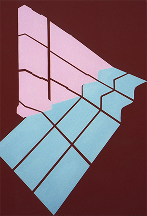
| Fig. 8: Double Window. This is not an exact Tritone, but is very close. The Red-Orange and slightly greenish Blue reinforce each other and create a somewhat jarring effect, which is not dissimilar to the Tritone in music. | ||
|
Click to play a Tritone |
||
| One principle I can’t help having noticed while doing this research is that the closer an interval gets to the tritone, the more interestingly/harmoniously it works as a colour combination. The tritone does appear to have some kind of magnetic effect on the colours around it — pulling them towards it, creating movement — which makes me think that there is some justifiable link to its musical equivalent. | ||
Tritones: |
||
|
Red—Green Red-Orange—Blue-Green Orange—Blue Yellow-Orange—Blue-Violet Yellow—Violet Yellow-Green—Red-Violet Green—Red, etc... |
||
The Perfect 5thThe Perfect 5th is considered to be the most consonant, stable interval of all, after the Octave. It forms the outer notes of a major or minor triad and is therefore present in most chords. It has the closest affinity to the tonal centre of any given melody and a chord based on the 5th scale degree is usually played before the final chord of a piece. In acoustics, it is the second overtone present when a note is played, the first being the Octave. [16]In painting, the Perfect 5th operates much like the Perfect 4th but it seems to have even more of a balanced feeling. In order for it to be experienced, there must be a contrast in the tonal value of the two colours and this is, in my opinion, where the stronger feeling of balance comes from. [17] It is like the Perfect 5th in music in that it has possibly the highest consonance in painting — more so than the Perfect 4th because of the extra tonal contrast. However, the further apart the intervals get on the colour wheel, the more subjective their interpretation becomes as they may be more easily perceived as their inversion — the interval that is created by going in the other direction around the colour wheel. |
||
 |
||
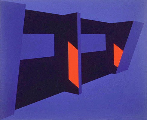
| Fig. 9: Pink and Green. The Perfect 5th is one of the highest consonances in both music and colour. The pink here acts as a red and contrasts well with the blue-green. The difference in tonal value helps to create even more of a contrast. | ||
|
Click to play a Perfect Fifth |
||
Perfect 5ths: |
||
|
Red—Blue-Green Red-Orange—Blue Orange—Blue-Violet Yellow-Orange—Violet Yellow—Red-Violet Yellow-Green—Red Green—Red-Orange Blue-Green—Orange Blue—Yellow-Orange Blue-Violet—Yellow Violet—Yellow-Green Red-Violet—Green |
||
The Minor and Major 6thsBoth the Major and Minor 6ths are considered to have an active, fluid quality and are considered to be the least stable of the consonant intervals. The Minor 6th is characterised by a ‘sad’ quality, much like its inversion, the Minor 3rd, as well as containing an element of contrast because of its wide spacing on the colour wheel.In colour, there is a strong feeling of polarity, partly achieved by the contrast in tone but also through a difference in character of the two colours, as they are so far apart on the colour wheel. If there is not enough contrast, a minor 3rd will be perceived. |
||
|
Click to play a Minor Sixth |
||
Minor 6ths: |
||
|
Red—Blue Red-Orange— Blue-Violet Orange—Violet Yellow-Orange—Red-Violet Yellow—Red Yellow-Green—Red-Orange Green—Orange Blue-Green—Yellow-Orange Blue—Yellow Blue-Violet —Yellow-Green Violet —Green Red-Violet—Blue-Green |
||
|
Click to play a Major Sixth |
||
Major 6ths: |
||
|
Red—Blue-Violet Red-Orange—Violet Orange—Red-Violet Yellow-Orange—Red Yellow—Red-Orange Yellow-Green—Orange Green—Yellow-Orange Blue-Green—Yellow Blue—Yellow-Green Blue-Violet —Green Violet —Blue-Green Red-Violet—Blue |
||
The Minor and Major 7thsIn music, the Major and Minor 7ths are dissonant intervals, but are often used in chords that appear just before a final cadence in a phrase or piece. They create dynamism and a feeling of movement towards the tonal centre, as they are but one step away from it.In art, they are the inversion of a Major or Minor 2nd so perception of a 7th will depend on a very strong tonal contrast. If it is perceived, a sharp contrast will be felt, that lends itself to a sharpened mood and increased tension in the work. [See Fig 4] |
||
|
Click to play a Minor Seventh |
||
|
Click to play a Major Seventh |
||
Minor 7ths: |
||
|
Red—Violet Red-Orange—Red-Violet Orange— Red Yellow-Orange—Red-Orange Yellow—Orange Yellow-Green—Yellow-Orange Green—Yellow Blue-Green—Yellow-Green Blue—Green Blue-Violet—Blue-Green Violet—Blue Red-Violet—Blue-Violet |
||
OctavesTo create octaves in a painting, a colour would have to be present in differing tonal variations, for a feeling of spaciousness that is similar to the musical octave. However, it is debatable whether the comparison works in terms of quality of consonance, as in music the octave is considered to be the most consonant interval, and in painting, although it is consonant, it is not the most interesting colour choice. But perhaps this is not so different after all: in music, although the octave is the most consonant, this does not make it the ‘strongest’ of intervals in terms of what is pleasing to the ear. It may be more stable but aurally, I find the perfect 4th or 5th or even a 3rd or 6th much more engaging. |
||
|
Click to play an Octave |
||
TriadsThe intervals I have discussed so far have been pairs. What would happen if we combined triads of colours, as in a musical chord? Let us take a traditional minor chord. This chord encompasses the base note and a minor 3rd and Perfect 5th above it. If we take Red-Orange as our base note, a 3rd up from that would be Yellow and a 5th from Red-Orange would be Blue. |
||
 |
||
| Fig. 10: Bright Day. If we apply the wavelength method of determining the starting colour of this 'chord', we have Orange-Red—Yellow—Blue, which equates to a Minor triad. However,if we use the tonal method, we would get Blue—Yellow—Orange-Red, a traditional major chord. | ||
|
Click to play a Minor Triad |
||
|
Click to play a Major Triad |
||
|
However, as I said before, one is more likely to perceive a smaller colour interval
than a larger, so the Perfect 5th (Blue) may be seen as a Perfect
4th (creating a perceived chord of scale degrees 1,3,4 instead of
the traditional 1,3,5). The other problem is the question of which
colour is perceived as the ‘starting’ colour of the chord
and which direction on the colour wheel one chooses to follow. What
if one started the chord with Blue, going in the direction Blue,
Red-Orange, Yellow? This would create a chord with the scale degrees
of 1,4,6, which equates to a Perfect 4th followed by a Minor 6th.
However, if one follows the other direction, Blue, Yellow, Orange-Red,
a traditional major chord is obtained (Major 3rd, followed by Perfect
5th). As to which colour to use as the starting ‘base note’,
most people are likely to choose the darkest colour to correlate
to the lowest note and the lightest colour to correlate to the highest note.
However, this is not how it would work in terms of wavelength, as I explained earlier, with Red having the longest wavelength and Violet the shortest. So if we create the chord according to wavelength, we have Red-Orange, Yellow, Blue, which creates the Minor triad we had above; but if we create the chord according to the principle of tonal value (darkest colour being the ‘lowest’), we would get Blue, Red-Orange, Yellow, which would amount to a Perfect 4th and a Minor 6th from the base (not a traditional triad). Looking at Fig.10 above, I can see a good argument for using the wavelength method to determine the order of colours. The strong Red-Orange does appear to be the base note and the Yellow next to it gives the feeling of the interval of a third. The Blue seems to be the weakest colour in the composition (not counting the black), demanding the least attention, so it seems to fit into the category of the 5th, providing a resounding backdrop for the Red-Orange. The black helps to heighten the effects of the other colours but does not affect the hue relationships between them. [18] |
||
| Because of the complexity involved in deciding on the direction from which intervals are counted, analysing a combination of more than two colours seems to be too great an endeavour to be able to fully devote enough time to in this paper. There are many paintings that feel ‘chordal’ but their intervals don't fall into the traditional Major and Minor sequences and this requires further analysis. Therefore I shall halt my exploration here with the hope of coming back to it at a later date when it can be given the attention it deserves. | ||
ConclusionAfter comparing the colour intervals to their musical counterparts, I do feel they share something in common — the colour intervals don’t have the same character as each of the musical intervals, but both seem to follow a similar pattern in terms of which work harmoniously and which don’t. In addition, I have realized, from this research, the importance of the element of contrast to both visual and musical compositions. So while these correlations may not all work on a practical level, they can at least give us a greater understanding of colour on a more metaphorical level. The idea of correlating colour intervals to musical intervals could possibly provide a new method of examining the way colour is used in visual compositions. It is worth analysing paintings that work well colourwise, to see how their intervals relate in terms of consonance and dissonance. I would invite the reader to apply the principles outlined in this paper to such works and to use their own perception of colour to investigate these ideas further. |
||
References and Notes |
||
|
1.
Wassily Kandinsky (translated by M.T.H. Sadler),
Concerning the Spiritual in Art
(New York: Dover Publications, Inc., 1977, originally published 1911).
(back to article)
2. See Hajo Düchting (translated by Penelope Crowe), Paul Klee — Painting Music (New York: Prestel-Verlag, 1997). (back to article) 3. Goethe, Johann Wolfgang von. (translated by Charles Eastlake) Theory of Colours, (Cambridge: MIT Press, 2002; originally published London: John Murray, 1840), pp. 298-299. (back to article) 4. It is commonly believed that the reason Newton divided the visible light spectrum into seven colours was to correspond to the seven notes in the musical scale. (back to article) 5. As I am writing this paper with the intention of it being of use to artists, I have focused on subtractive colour, which is based on the effects of coloured pigments. Additive colour, on the other hand, is the process of mixing coloured light. With additive colour, the more that colours are mixed, the lighter they become, whereas in subtractive colour, the more colours are mixed, the darker they become as less light gets reflected. (back to article) 6. Newton and Scriabin as well as some of the other theorists also started their colour/music scales with Red correlating to the note C. (back to article) 7. Quoted in Goethe’s Theory of Colours, see above p. 418. (back to article) 8. Some non-Western cultures have different concepts of consonance/dissonance as well as different tuning systems than the ones we are accustomed to in the West. However, for the purpose of this paper, I have focused on Western music and the equal-tempered tuning system, which equalises the distance between each note of the scale. (back to article) 9. E. Aldwell and C. Schachter, Harmony and Voice Leading (New York: Harcourt Brace Jovanovich, Inc., 1978) pp. 22-26. (back to article) |
||
| Return to top | ||